Over on
Grognardia, James Maliszewski asks after inspiring illustrations from published RPG adventures. Having just finished my series of retrospectives on ICE's Middle-Earth modules, artwork has been my mind quite a lot. The adage "never judge a book by its cover" doesn't hold up well in the RPG world. For novels it's absolute: while I love good covers (and abhor bad ones) on works of fiction, they never factor in my assessment of the novel's literary value. But there's something about role-playing, maybe the shared group experience behind it all, that leans heavily on the inspiration fired by cover artists. In fact, I'd go so far as to say that cover art can weigh in anywhere between 10%-20% in rating a module's success or failure. That's a huge amount of weight to attach to a single page, but there you have it.
The only two RPGs I invested serious amounts of time in were MERP and D&D, and so I'm doing two lists: my ten favorite covers of ICE's Tolkien modules and my ten favorite illustrations (most covers, but not all) from TSR's D&D products. This will amount to a heavy bit of enshrining Angus McBride and Erol Otus, but that's as it should be. They were the art-gods of their respective turf, McBride the solid historicist, Otus the psychedelic surrealist, and in Maliszewski's terms they "fired my imagination" more than any other RPG artists. Be sure to click on each of these illustrations for the larger image.
The Middle-Earth Role Playing System
1.
Riders of Rohan, Angus McBride. This is my favorite piece of cover art of any RPG product. In its Tolkien context, it spotlights a bleak culture in an amazing freeze-frame. The Rohirrim are closest to the Anglo-Saxons or even Norse in Middle-Earth, courageous yet hopeless, "riding to ruin" to embrace that Ragnarok-like annihilation of all that's good. The long defeat runs in their blood like all of the free peoples, but the horse-lords seem to
thrive on it, as if their history of repeated migrations and awful-odds warfare forged a culture of exultant fatalism. Peter Jackson nailed this perfectly at Dunharrow, when Theoden calmly tells his men they can't possibly prevail against Mordor's armies: "But we will meet them in battle nonetheless." That's three millennia of the long defeat talking, and captures the essence of the Rohirrim almost as good as this illustration.

2.
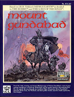
Mount Gundabad, Angus McBride. This one actually gave me a nightmare, though I can barely recall details beyond being yanked down that hellish maw in chains. I must have repressed what happened to me inside the mountain, and given the module's contents that's not surprising. Mount Gundabad is more than just a beehive of 13,000 orcs; it's a taloned organ of malignancy. There's sadism, sacrifice, and bloodthirsty rage; the orc warlords hate each other more than elves. All of this owes to the First-Age artifact as deadly as the One Ring, bathing the place in spiritual blackness. This is, simply, the best orc dungeon ever designed -- in or outside of Middle-Earth -- and I'm glad the cover could do it justice.

3.
The Lost Realm of Cardolan, Angus McBride. In some ways I consider this piece the most emblematic of McBride's talents. It grabs your attention right away with the action, and holds it with the hulking, meaty figure of the Barrow-wight. McBride was always able to nail down the solid reality demanded by Tolkien's world, which for all its myth served as a pre-history to our own, and an illustration like this could make me believe Middle-Earth actually existed. Every part of it shouts verisimilitude, from gritty melee to skull-adorned chain mail to rock pillars marking hallowed ground.

4.
Gorgoroth, Angus McBride. And here's another flawless rendering of Tolkien's undead. It portrays the Nazgul beyond Halloween cloaks and hoods, in kingly gear, but also without any mystical shrouding as if we were Frodo observing them through the filter of the One Ring. Seeing them this way in Mordor is somehow just right, as if there's no room for vague phantoms in the heart of Sauron's territory. And the yellow background, and Mount Doom, evoke a mood as thunderous as those galloping steeds. I wish the cover of the Angmar module had been this powerful.

5.
Havens of Gondor, Julek Keller. The best cover of these Tolkien modules
not done by Angus McBride is saturated in enough loss that it may as well be the Grey Havens. The module itself was scorned in the '80s as an empty product, but one I fell instantly in love with, though I admit the cover carries more that the usual 10%-20% weight value -- close to 30% in this case. There's something surpassing about it in a way that's hard to put my finger on, but easy enough to convey my feelings for. To this day I have fantasies of growing old by the Belfalas coastline, mixing with men and elves, and staring out to sea where that immortal elven king drowned searching his lost love.

6.
Ents of Fangorn, Angus McBride. Even if this module doesn't deliver as it should on the inside, it redeems by the outside, depicting the two best things about Middle-Earth: hobbits and ents. This cherished scene from
The Two Towers is rather exceptional for McBride, whose comfort zone was the dramatic portraits of evil or battle action, and it's all the more potent for it. In fact, I'd put this depiction of Treebeard almost on the same level as John Howe's. By rights there should be more treeish traits (branches and leaves eeking through the physique, as in the films), but I like this interpretation all the same.

7.
Southern Mirkwood, Chris White. I'm not the biggest fan of Chris White. He did the covers for
Goblin-Gate and
Shelob's Lair, and I thought her majesty the spider in particular deserved better. But tell me this picture doesn't rattle you after staring at it for a while. It may be leagues away from Angus McBride's Nazgul (see 4, above), but it's compelling in its own way. It actually puts me in mind of Erol Otus' well-known sketch of the spectre in the D&D Expert Rules manual. And the forest has a weird psychedelic vibe to it, as if it's noxiously alive and would close in on you if you blink.

8.
Greater Harad, Angus McBride. The ruins of Charnesra inspired me to design the most complex campaign of my gaming career, and the result was a complete overhaul of this module that makes ICE's "Greater Harad" now almost unrecognizable to me. All because of this cover: I looked at it and
saw -- like the way visionaries have epiphanies -- an underground cult launching suicidal sting operations across a sun-baked land; disaffected remnants of a cruel dynasty wanting to resurrect the "glory" of an old age; grim sophisticated cultures where you can find peace or freedom, but never both; and an evil plot on such a monstrous scale that would require the best out of the most experienced PCs to expose and bring down.

9.
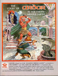
The Court of Ardor, Gail McIntosh. McIntosh did a lot of cover art reminiscent of old-school D&D, sketchy and rough around the edges, which is much preferable, in my view, to the excessively polished look of today's D&D products. Still, I wouldn't call McIntosh a favorite; she was hit-or-miss; for every
Ardor there was an
Umbar. But
Ardor is her very best, capturing a land of exotic peril in a frame that shouts action. We're used to seeing demons on other planes, in evil temples, or subterranean tombs, but this one (Lesh-Y) is an actual court noble, and those lethal cobras fit perfectly. This module on whole fired my imagination more than any other ICE product, and McIntosh's illustration had a part in that.

10.
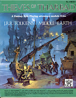
Thieves of Tharbad, Angus McBride. When I first saw this cover I instantly thought Lankhmar. It hints at a sordid cesspit so unlike the grand cities of Annuminas, Minas Anor, and Minas Ithil we associate with Middle-Earth. You can practically see extortion rings, prostitution networks, and cutthroat thieves at work behind the shadows. I always thought of Tharbad as rather anti-Tolkien in terms of the kind of things the professor would actually depict in works of fiction, and it gives lie to Gary Gygax's strident claim that "it is well nigh impossible to recreate any Tolkien-based fantasy while remaining within the boundaries of the D&D gaming system". The pulp influences of Robert Howard, Fletcher Pratt, and Fritz Leiber aren't so necessarily at odds with Tolkien's highbrow mythic backdrop as often thought. And that offers a perfect segue into the gritty, amoral world of D&D...
Old-School Dungeons & Dragons
1.
The Dungeon Master's Guide, David Sutherland. There is no illustration I associate more with the world of classic D&D than the cover of the DM's Guide. It even felt unholy when I first bought it, which in hindsight surprises me. My upbringing was mainstream religious -- raised Episcopalian, educated in Catholic schools -- and I always had the full support of family and teachers to pursue D&D as a hobby. But there were those few family acquaintances of a more fundamentalist bent, and I recall one in particular who was convinced that the game could only be Satanic based on this cover. In any case, the cover sums up D&D nicely, pitting a fighter, mage, and thief up against an avatar of hell (or so I first thought of efreeti, before I realized they were fire-genies), and I was always amused by the absence of a cleric, as if the efreet had the wisdom to kill the party's healer right off the bat.

2.
Castle Amber, Erol Otus. This one was continually on my mind when I was put through the module as a player. I expected that colossus to appear at any moment and crush our entire party, and this is what I mean when I talk about gaming artwork being a shared experience; it really set the tone for our adventure. It's Erol Otus' best piece, and like the cover of the DM's Guide shook my imagination in the way that these evil giantish-figures, for whatever reason, did so well. I could see myself on the top story of a building being crushed like cardboard, under the glare of those hugely insane eyes which regarded me about as significant as a gnat.

3.
The Lost City, Jim Holloway. This cover is so bloody inspired it makes me lament, more than any other art piece, the passing of D&D's Golden Age. Everything about it shouts the pulp fantasies of Howard and Leiber, from the masked Cynidicean, to the noxious-looking green mist circling his feet, to the general feel of a decadent society. Somehow both Holloway and Otus (above) hit artistic home runs for the two best D&D modules (aside from
Tomb of Horrors) ever designed. And Holloway's fired me up in a way that led me to flesh out the underground city in much more staggering detail for subsequent campaigns. It was truly a sandbox of endless opportunity.

4.
The Tomb of Horrors (Back), Erol Otus. Even today this image scares the be-Jesus out of me. I want to shout at the poor fool poking his torch around the death mouth, "GET AWAY FROM THAT THING!" And I can't help thinking about sex-change looking at the misty archway, even if that brutal enchantment is many rooms away. The green devil mouth remains for me the most iconic symbol of evil in D&D, and summons a world of outrageous unfairness, irrevocable death, and sadistic DM'ing that made the hobby so fun.

5.
Descent into the Depths of the Earth, Jim Roslof. As a teen my favorite Roslof piece was the cover of
Ghost Tower of Inverness, which I used to stare at for long periods of time. However, Maliszewski got me rethinking with his
enthusiasm for D1-D2. The shrine of the Kuo-Toa is of course a very good dungeon, but one I tend to forget about alongside its mightier sequels, especially
Vault of the Drow which even broadcasts a memorable Erol Otus cover. But I have to agree that this clash at the foot of the kuo-toan altar deserves high mention. I love the way the blues and greens and yellows mix, and bathe the lobster-goddess statue in a weird spiritual candor.

6.
In the Dungeons of the Slave Lords, Erol Otus. I was never a fan of the slaver's quartet, but this final chapter is admittedly good, and the cover is an absolute gem. There's something dreadfully intimate about these poor naked PCs (loincloths included for form's sake, no doubt) stripped of all their possessions, spellbooks, weapons, relying on whatever they can find on the floor to escape these horrible caves. At the very least, the module is a serious test of players' resources when they're literally stripped to the bone. Otus' illustration conveys the unfairness brilliantly, and his myconids (fungus-men) are as creepy as any medusa.

7.
The Player's Handbook, Dave Trampier. James Maliszewski makes
a fascinating case for this being the "best cover ever" of any D&D accessory, and while I wouldn't go that far, his feelings for the piece do square with some of my own. It depicts a dungeon in the broadest sense, with PCs "fighting evil in its very lair". It snapshots a planned expedition, moreover, as evidenced by the body count of the lizard men. Most importantly (from my point of view), these PCs aren't necessarily heroes, indeed they rather have the look of venal mercenaries ("the two thieves prying the gems from the demonic idols eyes are looking down on their companions as if they hope no one notices their theft"). D&D is as much about anti-heroes as it is heroes, and Trampier's cover breathes this world of amoral pulp fantasy in a very primal way. While I insist the DM's Guide cover holds pride of place, I suspect more gamers would agree with Maliszewski's prioritizing that of the Player's Handbook.

8.
Return to the Tomb of Horrors (Inside), Arnie Swekel. The boxed sets of the '90s tended to have artwork as disappointing as their contents, but the demi-lich sequel was exceptional in every way. This drawing kicks ass in portraying an ultimate showdown between PCs and Acerak -- a showdown, frankly, that's so unlikely it serves as a kind of Platonic ideal or goal, ever approached, never reached. For this is a module where the entire party can die on any page. But it's fun to fantasize about actually making it to the last room of the Fortress of Conclusion, and going down desperately trying to liberate the 2,692 souls trapped in Acerak's phylactery, souls he needs for his outrageous ambition to become the god of (and one with) the Negative Material Plane.

9.
Ravenloft (Inside), Clyde Caldwell. I never cared for the cover of
Ravenloft, but the inside illustrations score big time, and this one in particular is as iconic as the video frame of the taxi cab pulling up in front of the MacNeil house in
The Exorcist. That shot was inspired by a Magritte painting ("Empire of Light"), and this one has the same kind of look to it, as if Caldwell had been mining a museum of gothic classics and wanted to capture something unelaborately elemental. Caldwell was never a favorite of mine, mind you, for all the
Dragonlance stuff, but with
Ravenloft he tapped into something powerful. It remains the best undead module of all time, and his artistry did it justice.

10.
Oriental Adventures, Jeff Easley. I was an avid fan of early-'80s ninja films (they're so embarrassing by today's standards), and here, finally, was an entire alternate D&D world for the Asian cultures. The cover is airy and exotic as the western player's handbook is earthy and subterranean, and pits two essential character classes against each other, samurai and ninja. Many westerns would say that symbolizes "honor" vs. "shame", but of course every class operates out of its
own code of honor and shame, so the duality isn't quite that simple. Whatever that white beast is, it meshes brilliantly with the background of the clouds and "Japanese" castle.
Dragon MagazineBy way of epilogue, I'm going to include three cover pieces of
Dragon which I loved to no end: Denis Beauvais' "chess series".

1.
Dragon #83, Denis Beauvais. I wasn't yet a subscriber of
Dragon when this issue was published. I back-ordered it around a year later, after my friend put me through the deathly awesome
Dancing Hut module, which is arguably the most outstanding contribution ever made to the magazine (or at least, from the stretch of issues I'm familiar with). I had no idea that its cover was a chess piece, and so that was a double-orgasm when it arrived in the mail. And while Jeff Easley's cover for the official
Dancing Hut of Baba Yaga published later in the '90s is unforgettable, to this day I think of this chess-cover whenever thinking of the old crone who terrorized countrysides and kidnapped and ate people.

2.
Dragon #86, Denis Beauvais. This was my first issue of
Dragon by paid subscription, and I thought I'd gone to heaven. Role-playing and chess -- my two favorite hobbies -- fused in one. And it was a good issue too. It jump-started the Suel pantheon series, from which Norebo (god of luck and gambling) instantly became the new deity for my thief character. There were even dragon clerics detailed, a concept I still have a hard time wrapping my mind around, though I suppose Tiamat and Bahamut exist to be glorified by at least some of their scaled kin. And an article on familiars redressed a balance by playing fair ball with wizards of all alignments. But for me, the chess cover was the best part of the whole package.

3.
Dragon #89, Denis Beauvais. I don't know that this issue is especially memorable aside from its cover. There was an article on six special magical shields that I got use out of, a fantastic article for Gamma World on how to develop PC characters who are mutant animals, some other stuff. But some days this is my favorite chess cover for the encased brain; on others I prefer the barely visible cadavers of issues #83 and #86 staring out at the reader. But there's a twisted omnipotence at work here, where every piece on the board is a virtual pawn, from the actual pawns to the kings and queens -- a sly commentary, perhaps, on the nature of killer dungeon masters.
 On Facebook, Stephen Carlson links to a brilliant analysis of the Star Wars films by Rod Hilton. This critic suggests the proper viewing order for the films -- which he calls the "Machete Order" -- is IV, V, II, III, VI. Meaning that Phantom Menace doesn't exist, and that Clones and Sith get wedged in between Empire and Jedi. Hilton's reasoning:
 Unfortunately, Return of the Jedi is so weak, that Hilton's repositioning episodes around it amounts to little more than polishing a mound of feces. His "Machete Order", brilliant as it is, remains far too generous. It must be said that episode VI is almost as bad as I, and II is only a slightly above those two. If I had to use the amazon 5-star rating system:
 So if there is any decent trilogy to be salvaged out of this mess, it is what I call the Order of Darkness: III, IV, and V:

